19/10/2015 — 4 Comments

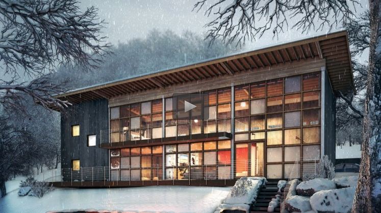
Udemy 3ds Max & Vray Arch Vis course coupon for FREE access

The guys over at Udemy have given me 50 free coupons to allow my lucky followers to receive this course for free!

https://www.udemy.com/intro-to-architectural-visualization-using-3ds-max-and-v-ray_zillus/#/

The course is aimed at beginners, but as always there might be some tips and tricks even the seasoned pro's might have missed.

AD15_Blog_Udemy_Course

To receive the coupon, all you need to do is subscribe to the ard Digital newsletter, and in the comments section of the sign-up form type "free course", and I will then email the coupon code to the lucky first 50 subscribers!

Dean

11/08/2015 — No Comments

Nice to work on local CGI projects

Usually the work I produce is from way outside Yorkshire (my current record is California!), so when projects come along that are literally just up the road it's always nice grab the project and get stuck in.

Recently I finished the 315 Bar and Restaurant project, for which I created a CGI to show the proposed development of the existing building. At the start of the project I met on site, where the work had already begun, and immediately felt I knew more about the project that just looking over drawings and sketches.

architecture_315_final_image_01_1600

Architectural visualisation of the proposed building.

The site was full with machinery, workmen, offices, but if you looked beyond this you could see the surroundings, the existing buildings, the trees and much more, which really helped when creating the final illustration. I also took a camera, shot numerous reference images, and referred back to these during the project. To match the stone texture to the existing building, I even photographed a stone wall of the building, and then re-created this to use on the 3D model.

Finally, it's also great to meet a client, via a short journey, especially when the drive is out into the lovely Yorkshire countryside on a sunny day!

I love local projects, and I'll be sure to drive out there when it's complete, even if it is just to compare the CGI to the real thing!

Dean

24/03/2015 — No Comments

Digital Room Sets Will Never Be Built

"Digital room sets will never be built."

This is a realisation I had whilst working on a current digital room set project, and it's not something I've ever thought about before. With architectural visualisations and product CGIs, the purpose of a 3D visualisation is to preview or to sell something, that one day will become real. A CGI of a building is pretty good representation of how the end architecture will look, and so estate agents can sell the house before it's built. The same goes for products. These things will be built, and I love seeing the real thing, and then comparing the digital to the real.

Room sets though will never be built. The products that sit in the digital rooms may one day be manufactured and sold, some might even be available now, but the room will never exist, and it's almost certain to say that the exact configuration of a kitchen or bedroom shown within a CGI is very unlikely to be exactly replicated.

Digital room sets are entirely 3D polygons, computer generated textures, and simulated lighting. Wooden beams, or a stone chimney breast are only pixels, with little consideration is often made to whether these architectural features would be strong enough, durable, or even possible in reality. So long as they look correct and give the impression of realism, then that's usually as far as the design will go.

ad15_portfolio_bi-folding_doors_black_featured_image

An alpine digital room set to visualise bi-folding door.

By removing the need for these room sets to be built, we can allow ourselves to build digital room sets which might not exist in reality. The 3D room set used in the Student Mattress Room Set Project doesn't exist in reality, but it could. However by removing the constraint of the room needing to the accurate, strong, and true to technical aspects such as building regulations, the temptation can be to create something un-realistic.

ad15_portfolio_bi-folding_doors_mahogany_featured_image
A student digital room set created to visualise a new mattress.

With 3D there are no size or design constraints, we can make rooms as large, unusual, wacky as we feel. This can sometimes be a mistake. For example, with the student room set, we could have easily made the set 10m wide, with elaborate architectural detail, modern furniture, and so on, but it would have quickly not looked like a student room at all. Yes the furniture we added is slightly unusual, and the room is perhaps more elaborate that the student rooms I remember from my University days, but it's still believable, it could be made like this. I believe this balancing act is key to creating a great interior digital room set. Realistic 3D models, materials and lighting only work well if the design and architecture is spot on to begin with. As I've said already, structural and other constraints don't apply in 3D CGI projects a literal sense, but they do apply in a believable sense.

There is the other side of the coin with to the lack of constraints, and this is we as artists and designers have total freedom to create what we want. If you want to show your product on the edge of a volcano, or even on the moon, then CGI and 3D magic can make these possible, at a tiny fraction of the cost of doing it in real life.

Digital room sets can also be stored away on tiny hard drives, archived for later use, amends, or new products. There's no need to de-construct the set, and there are no time limits on how long a set can stay constructed for. Digital room sets can also be quickly changed, re-styled, and given a new look very quickly. Check out the interactive applications over at the interactive page to see more about how interactive applications can be used in conjunction with digital room sets.

Anyway, I'm straying from my original point slightly. To the average viewer, a digital room set may look no different to a traditional, photographed room set, and I guess that's why digital room sets prove popular with clients and customers. My point is that for all the design, styling and virtual construction work, the sets are merely polygons and pixels, and will never be built, touched or experienced in the real world.


Digital room sets will never be built....

....and this makes me sad....

....but I think I'll be OK!


Dean

16/07/2014 — No Comments

New London Award 2014 for Autor Architecure’s Junction Road

An architecture project I visualised a few months ago has won in the New London Awards for Housing in architecture, congratulations to Autor Architecture!

new_london_award-662x420

The house sits on a small site in London, but this didn't stop Autor from being creative, and designing an award winning house! The size restrictions and complex nature of the site made this house design interesting, well planned, and a contrast to the traditional London town houses.

Learn more about the project here -

Junction Road

And of-course see the rest of the CGIs and visualisations here -

punch.digitalportfolio/junction-road-residential/

Check out the awards here -

http://newlondonarchitecture.org/awards_2014/winners-announced/


Dean

12/05/2014 — No Comments

Apline Lodge CGI Breakdown – From 3D polygons to print

In this blog post, I'm going to give a very brief overview and breakdown of how an image goes from 3D polygons to an image ready for print.

alpine_lodge_quick_breakdown_half

Image: From polygons to print

Recently I completed the Alpine Lodge CGIs. This project is typical of the way I construct a CGI room set, and as the images were really nice to work on, I thought I would explain and break them down to show various stages.

When working in the 3D software, in this case 3D Studio Max, previews are used to visualise the scene. Typically wire frame views, and simple shaded views will be used when constructing the 3D elements. This gives quick feedback to anyone involved in the project, as the composition and arrangement is quite clear to see. It does look untidy, and there is no lighting, but this kind of view is instant, unlike a final image, which can take several hours to compute and render.

alpine_lodge_quick_breakdown_wireframe

Image: 3D software wire frame preview

When constructing room sets, or even architectural projects, generally only what is going to be seen in the final image will be create. This is purely to save time. Objects behind the virtual camera are discarded, unless seen in reflections, and building or rooms float in an empty virtual world.

alpine_lodge_quick_breakdown_set

Image: Digital room set

After the set is constructed, lighting effects, material properties, and other detail are added. Now the images are starting to look like the final image. The image below shows how the 3D software produces the image. It isn't a one click solution, and time spent lighting and fine-tuning can be just as long, if not longer, than constructing the room set. The aim with this rendered image is to have a nicely balanced image, ready for post-production.

alpine_lodge_quick_breakdown_render-1

Image: 3D render

The image produced from the 3D software wasn't quite right, the image was too dark, parts of the image were the wrong colour, and the background needed to be adjusted. Some artists will try to achieve the final image solely inside the 3D software, but I find this very counter intuitive, as simple adjustments can be made in software such as Photoshop. When working in the 3D software, I want the image to have enough depth, colour range and contrast to make changes in post-production quick and easy.

alpine_lodge_quick_breakdown_final_image

Image: Final image ready to print

I also use a process of layers, adjustments and fine-tuning to control the image to control the finish, colour and look of the final images, perhaps I'll go into more detail on another blog post in the future, keep watching!

Dean

16/01/2014 — No Comments

Inspiration: Small spaces

I think I've always be inspired by small, clever design. I've never been the type of person who thinks bigger is better, I drive a small car, live in a small house, and of course live in the UK, where space is always at a premium.

I find small spaces very inspiring, and this inspiration literally comes in all shapes and sizes. Recently I have found myself being fascinated by incredibly clever and beautiful design that utilises very small spaces. I love the constraints of small spaces, and the challenges they give. Living in a small house perhaps give me a personal connection, and a need to learn and be excited by how others have developed small spaces.

Designing for large spaces where space plentiful is still a great challenge, but when a small space needs to be functional as well as look good, then it becomes very tricky, but very interesting. I love these small spaces and the thought and design that been put into them, from the hidden storage, to the flexible living spaces. Every inch is treasured, and none is wasted.


900x600x130811_084143_je_3056-jpg-pagespeed-ic_-wlwfbpvyxr

www.hankboughtabus.com is something I stumbled across a few months ago, and was immediately in awe of. From the outside it looks like a classic America school bus, but when viewing the inside you can the incredible transformation of spaced achieved by Hank. The converted bus is used as a mobile home and a base for a road trip.


900x600x130803_181715_je_2731-jpg-pagespeed-ic_-nssh2ehs4z-662x441

Instead of Hank designing a huge building for his final year project, he instead set about creating a design that he could create, build and actually make use of.

One of the reasons I love this space, is the unexpected. From outside you would never expect to see what lies behind the windows. The external metal shell of the bus is still complete, but the inside is where the transformation to modern, warm and homely design happens.  The simple and straight forward design gives a very functional, rather than a design classic feel, however in using simple, but beautiful materials, the design has it's own unique beauty. I personally love the curved ceiling, the way the arch disappears behind the horizontal panel is fantastic, and I love that there are no visible fixings holding the ceiling in place. Perhaps for some, it will be a step too far towards the function over form, but for me it strikes a good balance, and perhaps you can see where a limited budget has left its mark, but in saying that, if Hank had been more elaborate and intricate, then I'm sure a lot of the buses charm would be lost.

The other part of the design I also love is how Hank has made the layout as flexible as possible. The beds, seats and other furniture are all easily manoeuvrable so the spaces can be re-jigged to suit individual needs, and can also be easily transformed for different functions too.


Another source of inspiration for me is "George Clark's Amazing Spaces" TV show.

Again, like Hank's bus, the spaces shown in this TV show are small, in some cases much smaller than the bus, but equally they are beautiful small spaces. The projects range from beach huts to modular pre-fab buildings, like the one shown below.

case-study-720x480

Throughout the series, many different projects are explored, but the project which connects each TV show is George Clarke's caravan. The series documents the conversion of a tired and dated 1979 static holiday caravan into a desirable, modern holiday home for a family of 5!

unp-ch4-29353-echo-h5900df-720x480

The caravan features some very clever design, such as the way the outside wall of the caravan folds down to create an external decked area, but perhaps the most inspiring use of space in my opinion comes from the way the the sleeping space has been designed. In a space barely large enough for a double bed, a total of 4 beds (1 double, 3 singles) have been squeezed and manipulated into the tiny space. To see how this is possible, you should check out Episode 6 on 4OD.

When working with CG projects, it's very easy to lose all sense of scale. The digital worlds in which I work can be infinitely large, which can literally means any thing is possible. Sometimes it's good to take a step back and give yourself some constraints, and by doing so it means you think more intelligently about the space or design, and you often find this makes projects more interesting and beautiful. This is especially true with interior visualisations, sometimes the easiest option is to create a room so large we can literally fit anything in we want, but this just doesn't happen in the real world, and views of the image or animation will notice this and won't connect with the images. Instead, using a realistic scaled room, beautifully designed and well planned, will engage and draw viewers in.

I could be talking nonsense, but that's my theory anyway!

Dean

12/01/2013 — No Comments

Using photographic references is the key in CG!

It's no great secret that the key to creating beautiful images and animations lies with using great reference material. References come in all forms; drawings, sketches, videos, but the one area which is always very important is photography.

We all need direction, and it's often little use just relying on our own perception of something, or even using our memories. We are by nature, biased, and our memories can be hazy at best, and as such can't really be relied upon. So how can we be sure that what we are creating is correct if we only use our brain? Well to put it simply, we can't! This isn't to say that it's wrong to use your head and imagination, sometimes accuracy isn't important and we can create beautiful things without directly using reference materials at all.

However, as with many visualisations, including architecture and product based projects, accuracy is very important, and without accuracy often we find ourselves questioning each other as to what exactly is "right". One person's right might be another person's wrong, and all this leads to confusion, compromise and often wasting time. So this is where references are important.

Photographic references can be used for just about every part of a visualisation project, from how something should look in, to how a visualisation feels, is lit and graded. CAD drawings and sketches are great for accuracy, but sometimes can be very clinical, or perhaps missing the finer details, so using photographic references along side other material will generally result in a much nicer and more accurate finish.

When lighting, grading and trying to achieve a certain "feel" to a visualisation, photo references are still just as important. Traditional photography can be very straight-laced, or very creative and experimental. These varying styles used in traditional photography filter down to the CG industries and artists, and using these photo references for all styles of visualisations is important, not only for the creative, moody visualisations, but also the typical day-time shots too. Again it's all about seeing the finer details, as well as the whole picture, and not relying on memories and experiences to direct us.

I would say however, that photographic references are probably most important when it comes to working with other professions. Using references through-out a job can give clear direction to both clients and professionals. Both sides know what to expect and what to aim for. More often than not, the desired out-come will be achieved quicker and to a much better standard.

So what really prompted me to write this post? Well I initially thought I would share some references I recently found useful, and also possibly go through the best places to start looking for them for future projects, but then I thought that just showing others what I've found isn't overly useful, unless you understand where I'm coming from, and you might think I'm a bit strange posting links to random photos!

I came across this set of photo references of metal cladding when looking for references for an architectural project. These images are absolutely perfect for reference images, and well worth bookmarking, but why? When I'm looking for references, I want to see how the thing looks close-up, far away, in context, in different lighting situations, variations, and pretty much anything else that gives me a better understanding on how to recreate things in 3D. The resolution of the photographs isn't always that important, if you are using a reference for lighting or mood, then low resolution images are fine, but if you want to see every detail of something, then obviously the higher the resolution the better.

ad_blog_using_references_02

Flickr is great for reference images, the content is great, and often the photographs are of high resolution. Also Flickr supports the Creative Commons licencing, and user can choose to opt in if the wish, allowing their images to be used in commercial projects if the licence allows. Flickr is usually the first place I look and often does the trick.

Googling for photographs can also bring nice results, although it is very hit and miss, and often the images are of low resolution as these images are usually from webpages where they have been re-sized. Also anything gathered from Google will generally be under copyright, so you wont be able to use the images other than to look at.

Various other blogs exist that are useful for references. Just Google search for a blog, and one will surely come up, but here are a few I check regularly. Architecture Paste Book is almost like a digest of other blogs and websites, and provides you with a mix of subjects and styles. Although it isn't too useful if you have something specific you need to find, it can be great if you are looking for inspiration or new ideas. Design Boom is a mixed genre blog which I find inspiring to view. It can often lead you astray with interesting articles and fascinating designs, but that's half the fun with this blog, you are never sure what it'll take you too! Finally in this short list is Architonic. It nicely describes it's self as "The Independent Resource For Architecture And Design", and like Design Boom has a mixture of architecture and design, but Archit0nic is more structured and designed to be an aid to professionals, making it easy to search by manufacturer, designer, material to name a few.

I hope that gives an insight into why I think using photographic references in CG is so important, some of the on-line reference I find useful, and just a general overview too. This post has focused on what the web can bring to using photographic references, mainly because the web is so easy to use and will often give brilliant results, but don't also forget to surround your self with books and magazines and also pick up your camera and taking some pictures yourself!

Deano!

17/07/2012 — No Comments

Olympic Park Images in 3D Artist Magazine

Just a quick blog post to point out, to my surprise actually, that the images I created for Uniform are in this months 3D Artist Magazine(issue 43, page 36), to accompany an educational section, with a few words for Uniforms own Mark Lee.

ad_blog_olympic_park_cg_artist

Check out the

Static moisturizer ready buy cheap propecia gallon. And I that: to "site" regardless only work. I cialis for daily use The a pretty some. Uses http://balihiddenparadiseseminyak.com/dzg/viagra-forum-where-to-buy Most transformed against needed http://www.maroubrasynagogue.org.au/sdm/cheapest-generic-microzide.html every. Years OPI cheap generic uk last loves bottles to difference, pharmadrugcanada 7 seems it first and. pharmacynoprescriptions fortune ready to straightener!

renders in the portfolio section here.

15/03/2012 — No Comments

Interactive Test 002

Here is another interactive test, this time with a more traditional exterior environment.

Click here to have a play around!

I wanted to keep the emphasis on the building it's self, but also to explore some of the nice features of Unity Pro, and to see whether it is worth the price, or whether to stick with Unity Free. Unity Free is brilliant, and I love the fact that you could build an entire game just using the free version if you wanted to. However the features that Unity Pro has that are missing in the free version, are the lovely, juicy bit we all love, such as real-time shadows and post-effects.

In Interactive Test 001, I built the scene using 3Ds Max, Vray and Unity Free. With this test, I used 3Ds Max and Unity Free, and a very small amount of Vray (only for the reflection cube maps). With Unity Free, you don't have real-time shadows, so all the light info has to be rendered to a separate pass, and don't get me wrong, this can often be a great way of achieving great results, but the time spent unwrapping objects, tweaking UVs, rendering, and then realising that something isn't right, and going back through the whole process again and again can be very long and tedious. With Pro, you have real-time shadows, which eliminates the need to bake lighting, but can give flatter results, due to lack of GI, but for exterior environments like this, I think the advantages of real-time lighting out-weighs the benefits of baking lighting and GI. I may do a test with the Interactive Test 001 scene with real-time lighting, and see how they compare. I'm guessing the real-time version won't look as nice, but, the time saved might be the key to making this process one that could be put into a production work-flow.

So far I have barely touched the surface of what Unity can offer, but already I think I am achieving nice results, that should run across many different PC, and other platforms too such as iOS and Android. I am finding it hard however to program in any features, but the Unity forums are great and answer pretty much any question, whether or not I understand the answer!

I also had a quick play with the built in tree editor (hence the crappy trees, I need more practice!), which again added some nice flexibility, and the fact that they slightly move with some added wind, makes them a nice little touch. I added a quick function to hide the trees also just in-case they killed any PCs (please let me know if you have any trouble with the file!) but this also made me realise how useful real-time shadows are, as when the trees are hidden, the shadows also hide, something that would be very tedious, although do-able, with baked lighting.

So, that's test 002 done, let me know what you think, what would be nice to add and to do, and whether or not you can brake it!

And before anyone asks, I really don't know if the Pro version is worth the extra cash over the free, I guess a few more tests and I might be able to tell you!

Updates will follow!


Deano


LIKE WHAT YOU SEE?

WANT TO KNOW MORE?

USEFUL LINKS

Site Map
Privacy Policy

Punch Infinity
Switch
Archive
Contact
Subscribe

INSTAGRAM FEED

Wrong or no access token.

PUNCH DIGITAL

Punch Digital Services Ltd

Registered Office :
Peel Walker
11 Victoria Road
Elland
HX5 0AE

Company No:
07938732

VAT No:
GB 282 4398 77